Please post no more than five images a day and respond to as many images as you post. Critics, please be constructive, specific, and nice! Moderated by gahspidy and mtbbrian.
By posting on the Photo Critique forum you agree to post only your own photos, be respectful, and give back as much as you receive. This is a moderated forum and anything abusive or
off-topic will be removed.
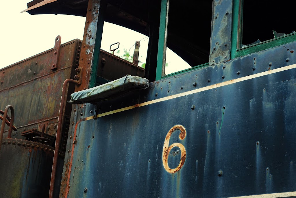
DB - The bottom shot seems better cropped/composed. The top shot is OK but seems to tilted for me, and there's also too much happening. I see the 6 there and note as an interesting sidebar, but there really doesn't seem to be any particular area to look at in the top one. The bottom shot looks best but I think there could be a little more space below the bottom of the door. I like the dark area on the upper left side.
G
Photography Software and Post Processing Forum Moderator. Visit here!
-----------------------------------------------------------------------------------------
Feel free to edit and repost my photos as part of your critique.
-----------------------------------------------------------------------------------------
That crop says a lot more to me than the original. It could be part of a series ... Not sure which series yet, but something.
G
Photography Software and Post Processing Forum Moderator. Visit here!
-----------------------------------------------------------------------------------------
Feel free to edit and repost my photos as part of your critique.
-----------------------------------------------------------------------------------------


 LinkBack URL
 About LinkBacks


 Reply With Quote

