Please post no more than five images a day and respond to as many images as you post. Critics, please be constructive, specific, and nice! Moderated by gahspidy and mtbbrian.
By posting on the Photo Critique forum you agree to post only your own photos, be respectful, and give back as much as you receive. This is a moderated forum and anything abusive or
off-topic will be removed.
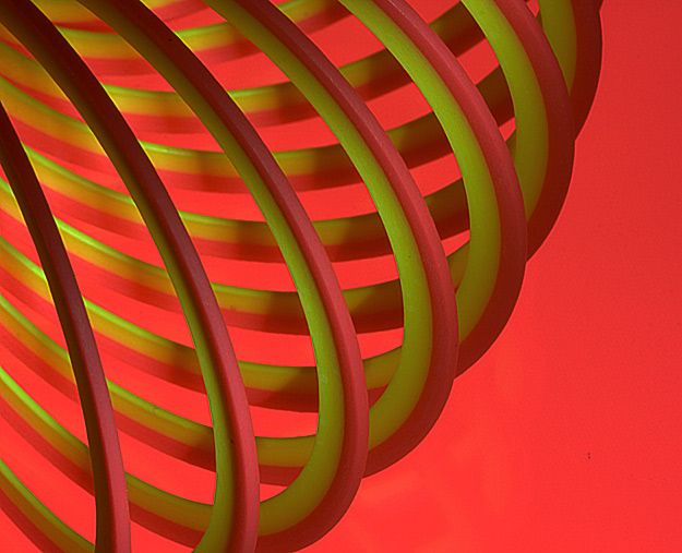
Wow, pretty impressive Arne. I love the sharpness! The composition is also great. Seems futuristic, contemporary. My only objection is the background being that bright red, which overwhelms the more subtle colors of the slinky. It is also too close to the red part of the (slinky) subject.
Also, there is a rule in graphics and color theory that the background needs to be darker than the subject. This rule can be and is successfully broken on occasion - think black text on white background - but usually, to make your subject pop you really need to make it darker.
G
Photography Software and Post Processing Forum Moderator. Visit here!
-----------------------------------------------------------------------------------------
Feel free to edit and repost my photos as part of your critique.
-----------------------------------------------------------------------------------------


 LinkBack URL
 About LinkBacks


 Reply With Quote

