Please post no more than five images a day and respond to as many images as you post. Critics, please be constructive, specific, and nice! Moderated by gahspidy and mtbbrian.
By posting on the Photo Critique forum you agree to post only your own photos, be respectful, and give back as much as you receive. This is a moderated forum and anything abusive or
off-topic will be removed.
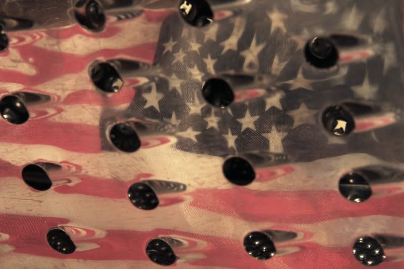
This is really interesting. I did not notice the flag till i re-read the title. When i look at the image i have a hard time figuring out where my eyes should go. Great effect, maybe have the flag face the normal way, or would that give it away too fast?
I like this, Arne. I enjoy the effect and reflection of the flag on the old worn texture of the grater. The graterholes remind me of motorcycle exhaust pipes and the flag reflection gives the overall feel of a Harley or some motoring americana somehow.
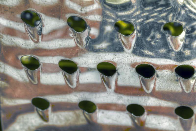
the only nitpik is lose the green glow from the holes of whatever was behind there.
The neon green does not go with the red, white and blue on chrome deal here.
You come up with the most fascinating abstracts. Products, no doubt, of an agile and imaginative noggin. I love this. Not exactly sure how to critique it. I quite like the green glow and smooth textures of the holes... especially juxtaposed against the rough, grungy texture of the flag. Very original work, as usual.
The first time I looked at this image I was looking for a sewer grate but couldn't figure out where you would see a chrome one. A veggie or cheese grater makes a lot more sense to me. Thanks Gary. I like the distortion of the flag, the sharpness of the grater and the mystery of the green BG. I love good reflection shots and this is one of them.
Ed
Thanks for the great comments!
Dray,I did get this particular idea from a photo magazine, just to be fair. I did tweak it some, but I can't take total credit.
Interesting about the green, I'll try to do something with that and see what I get.
Unusual ... muted colors in a good way. The patterns are neat, but I really want all the holes or whatever they are to be sharp: needs more DOF ( dang, I think the last three images I commented on all had the same problem). Love the blue.
G
Photography Software and Post Processing Forum Moderator. Visit here!
-----------------------------------------------------------------------------------------
Feel free to edit and repost my photos as part of your critique.
-----------------------------------------------------------------------------------------
I love the idea, very inspiring, I think it could be interesting to try different backgrounds although I am not quite sure what, the opportunities to have contrasting subjects are certainly there.
So, I come back to this one because i really enjoy the reflection image blended with the contours and texture of the old grater. I'm still feeling that the green behind the holes bug me a bit but I think there might be something to it.
My only real wish here for improvement would be to have the similar space between the grater holes and the frame edge on both sides. the right side frame is right up against the holes and I think would benefit from a bit of space.
The title is also clever.
Last edited by gahspidy; 03-07-2011 at 10:25 AM.
Reason: Sticking as Featured Photo. March 7, 2011


 LinkBack URL
 About LinkBacks


 Reply With Quote