Photo Critique Forum

Please post no more than five images a day and respond to as many images as you post. Critics, please be constructive, specific, and nice! Moderated by gahspidy and mtbbrian.
Featured Photo
Photo by hminx

Photo by hminx
Featured Photo Archive >>
By posting on the Photo Critique forum you agree to post only your own photos, be respectful, and give back as much as you receive. This is a moderated forum and anything abusive or off-topic will be removed.
Results 1 to 15 of 15
  1. #1
    Senior Member AgingEyes's Avatar
    Join Date
    Oct 2007
    Posts
    3,103

    Assumption Cathedral

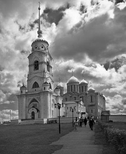
    Want to share with you a travel photo: Assumption Cathedral of Vladimir, Russia:

    Assumption Cathedral-assumption-cathedral-vladimir.jpg

  2. #2
    MB1
    MB1 is offline
    The Skeptical Photographer MB1's Avatar
    Join Date
    Jun 2004
    Location
    Washington, DC and Clermont, FL
    Posts
    3,144

    Re: Assumption Cathedral

    Great sky and lighting. The people walking towards the cathedral give a nice perspective.

    About the only thing I could suggest that might make a small improvement would be to crop from the bottom to just past the split in the sidewalk.
    No, I DON'T need that.

  3. #3
    project forum co-moderator Frog's Avatar
    Join Date
    Sep 2006
    Location
    wa state
    Posts
    11,195

    Re: Assumption Cathedral

    I agree with MB1 and also wish there was a little more space at top.
    Keep Shooting!

    CHECK OUT THE PHOTO PROJECT FORUM
    http://forums.photographyreview.com/...splay.php?f=34

    Please refrain from editing my photos without asking.

  4. #4
    Senior Shooter Greg McCary's Avatar
    Join Date
    Jun 2006
    Location
    Rome Ga.
    Posts
    10,550

    Re: Assumption Cathedral

    MB1 nailed it. Great image. I like it....
    I am like Barney Fife, I have a gun but Andy makes me keep the bullet in my pocket..

    Sony a99/a7R

  5. #5
    Member
    Join Date
    Aug 2007
    Location
    Walnut creek, CA, U.S.A
    Posts
    318

    Re: Assumption Cathedral

    AgingEyes
    Good shot. But I think it 'd be better with more sky on the top. And I think you should turn right the image. It looks like the bell tower is falling on the left.

    And one more... The slice on the bottom. It isn't necessary here

  6. #6
    Member chaman's Avatar
    Join Date
    Dec 2007
    Location
    Puerto Rico
    Posts
    270

    Re: Assumption Cathedral

    The sky is stunning. Nice one!

  7. #7
    mod squad gahspidy's Avatar
    Join Date
    Feb 2004
    Location
    N.Y. U.S.A.
    Posts
    8,368

    Re: Assumption Cathedral

    Really well done, AE. I agree with all suggestions here for improving an already solid shot. A slight tilt to the right, a slight crop of the bottom and a bit more sky which could easily be added in PS if you cared to. Excellent lighting and exposure.
    good work
    Last edited by gahspidy; 12-22-2007 at 08:48 PM. Reason: Sticking as Featured Photo. December 22, 2007.
    please do not edit and repost my photos


    gary


  8. #8
    Senior Member AgingEyes's Avatar
    Join Date
    Oct 2007
    Posts
    3,103

    Re: Assumption Cathedral

    Thank you for the comments everyone!

    Seemingly, some error happened to the bottom part of my image and I didn't notice it until some of you pointed it out. In the original photo, there's more space at the top but some had to be cut out to fit the new perspective.

    Here's another copy:

    Assumption Cathedral-assumption-cathedral-vladimir-1.jpg

    Personally I wish the whole image were better. But, like some of you, I like the sky :-)

  9. #9
    Member
    Join Date
    Aug 2007
    Location
    Walnut creek, CA, U.S.A
    Posts
    318

    Re: Assumption Cathedral

    AgingEyes

    The second one is much better! I like it.

  10. #10
    photo gallery Mod. starriderrick's Avatar
    Join Date
    Oct 2004
    Location
    Mountain View, California, United States
    Posts
    10,487

    Re: Assumption Cathedral

    Nice work! Congratulations on the Featured Photo sticky.Well deserved.


  11. #11
    Senior Member AgingEyes's Avatar
    Join Date
    Oct 2007
    Posts
    3,103

    Re: Assumption Cathedral

    Quote Originally Posted by starriderrick
    Nice work! Congratulations on the Featured Photo sticky.Well deserved.
    Thank you for the kind words!

  12. #12
    Coastal Flyer Coastal Flyer's Avatar
    Join Date
    Jan 2006
    Location
    San Diego, CA USA
    Posts
    2,262

    Re: Assumption Cathedral

    AE,

    The second shot improves an already very nice photo. The BW is perfect for this image. Congrats on the Feature Photo, this is most deserved.

    CF
    Coastal Flyer

    :yikes:

  13. #13
    Junior Member
    Join Date
    Dec 2007
    Posts
    36

    Re: Assumption Cathedral

    You have a nice contrast and I love your idea in turning the picture black and white. Did you use HDR effect on this image?
    I've taken every step in my life with appreciation that i may never pass this way again. Document memories with a camera on hand

  14. #14
    Senior Member AgingEyes's Avatar
    Join Date
    Oct 2007
    Posts
    3,103

    Re: Assumption Cathedral

    Quote Originally Posted by open_shutters
    You have a nice contrast and I love your idea in turning the picture black and white. Did you use HDR effect on this image?
    Thank you for looking and commenting!

    Not sure about what you meant by HDR effect. If you meant taking more than one photos of the same scene and combine them afterwards, then no. I did have to balance the exposure a bit at pp. It's all just one photo. It wasn't really a bright sunny sun with contrasty lighting that day. It was cloudy, rainy with sunny breaks kind of day that day.

  15. #15
    GB1
    GB1 is offline
    Moderator GB1's Avatar
    Join Date
    Feb 2004
    Location
    San Diego CA
    Posts
    9,960

    Re: Assumption Cathedral

    A very pretty and dramatic shot. I think Russia is known for bold, cloudy skies. This shot shows that.

    For suggestions, I'd rotate the image a little CW, say 1.5 degrees or so, and also put the upper part you cropped out back in (as I would like a tad more space up there). The bottom part of the image is a tad bit dark too, IMO, and perhaps could be sharpened up just a little.

    This looks like a nice place to visit. It isn't on my list at this point but after seeing this shot, maybe it should be.
    GB
    Photography Software and Post Processing Forum Moderator. Visit here!

    -----------------------------------------------------------------------------------------
    Feel free to edit and repost my photos as part of your critique.
    -----------------------------------------------------------------------------------------

    My Site

Thread Information

Users Browsing this Thread

There are currently 1 users browsing this thread. (0 members and 1 guests)

Posting Permissions

  • You may not post new threads
  • You may not post replies
  • You may not post attachments
  • You may not edit your posts
  •