Please post no more than five images a day and respond to as many images as you post. Critics, please be constructive, specific, and nice! Moderated by gahspidy and mtbbrian.
By posting on the Photo Critique forum you agree to post only your own photos, be respectful, and give back as much as you receive. This is a moderated forum and anything abusive or
off-topic will be removed.
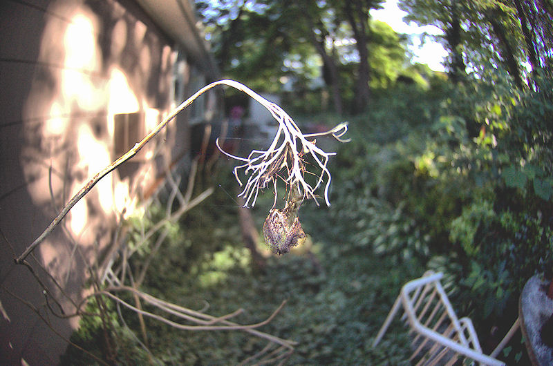
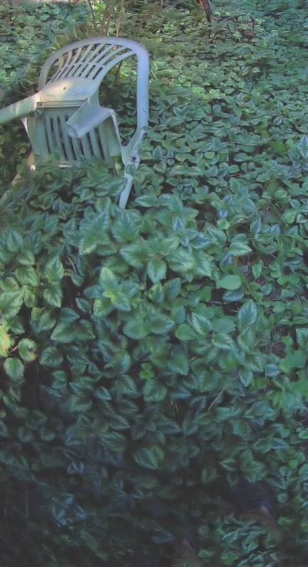
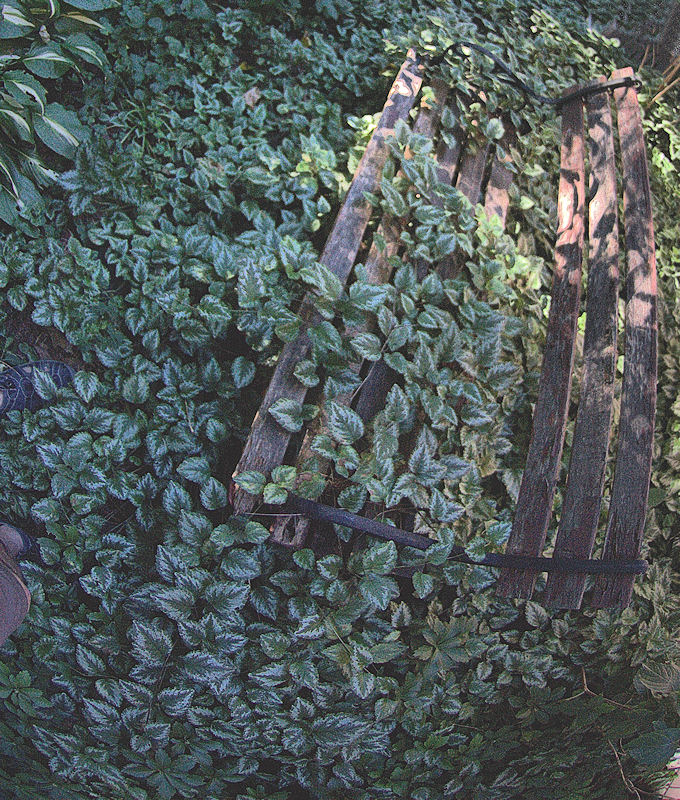
Overall, I like it. The nature-overpowering-modernity is a favorite theme of mine in photography, and it shows up in all the photos to some extent, but I think it's executed the best in the 2nd and 3rd photos. The high-lights look kinda burnt out in the first one. I'm not sure if that's intentional or not but I personally think it takes away from the image, so I'd recommend dialing that back a little. The white balance also looks a little off in the 2nd and 3rd photos. But overall good work.


 LinkBack URL
 About LinkBacks


 Reply With Quote