Please post no more than five images a day and respond to as many images as you post. Critics, please be constructive, specific, and nice! Moderated by gahspidy and mtbbrian.
By posting on the Photo Critique forum you agree to post only your own photos, be respectful, and give back as much as you receive. This is a moderated forum and anything abusive or
off-topic will be removed.
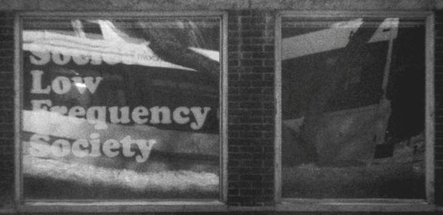
Don - The top image isn't bad. I would clip off the left side stuff there. That would leave a very colorful and interesting design.
The bottom image suffers from attention being forced to two uninteresting subjects. If you had backed off and gotten more context, this could potentially have been interesting. As is, there just isn't much there.
Gb
Photography Software and Post Processing Forum Moderator. Visit here!
-----------------------------------------------------------------------------------------
Feel free to edit and repost my photos as part of your critique.
-----------------------------------------------------------------------------------------
Love the colors in the first but leaves me wanting to see the complete symbols. Can you get off the bus there?
Can't read the first word in the secons shot.


 LinkBack URL
 About LinkBacks


 Reply With Quote

