Photo Critique Forum

Please post no more than five images a day and respond to as many images as you post. Critics, please be constructive, specific, and nice! Moderated by gahspidy and mtbbrian.
Featured Photo
Photo by hminx

Photo by hminx
Featured Photo Archive >>
By posting on the Photo Critique forum you agree to post only your own photos, be respectful, and give back as much as you receive. This is a moderated forum and anything abusive or off-topic will be removed.
Results 1 to 5 of 5

Thread: Red & Blue 2

  1. #1
    Senior Member arne saknussen's Avatar
    Join Date
    Jul 2010
    Location
    Atlanta, GA
    Posts
    1,145

    Red & Blue 2

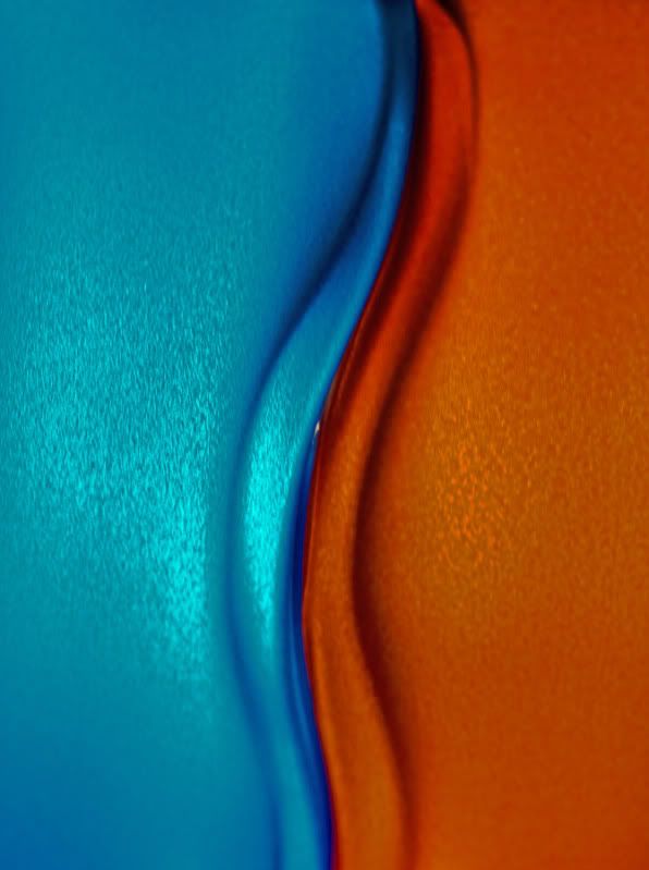
    This is a pair of flower vases. I am still experimenting with them, so c & c away.


  2. #2
    Senior Member arne saknussen's Avatar
    Join Date
    Jul 2010
    Location
    Atlanta, GA
    Posts
    1,145

    Re: Red & Blue 2

    I think this one is a little better.


  3. #3
    Love + Music + Photography = Life CLKunst's Avatar
    Join Date
    Apr 2004
    Location
    Asheville, North Carolina, United States
    Posts
    2,035

    Re: Red & Blue 2

    Hi Tom!

    Your DOF and the contact between the vases is better in the second shot. I realize this was a vertical shot by I really like this when it's rotated to the right and looked at as a horizontal. There is also one little speck of light coming through that's almost dead center, personally I'd clone it out as makes a hiccup in the lines. Really like the fat colors and the hot and cold contrasts.

    CLK
    C.L. Kunst - CLicKs Photography
    Asheville Photographer
    www.clicksphotography.net


  4. #4
    Senior Member armando_m's Avatar
    Join Date
    Oct 2009
    Location
    Guadalajara Mexico
    Posts
    4,486

    Re: Red & Blue 2

    Arne,

    Nice to continue seeing your experiments!
    this one in particular is not as attractive as the previous ones you have shown
    the single line dividing the colors is not as interesting as the intricate patterns you obtained before and the light is simple, no dramatic effects either

  5. #5
    Re Member LeeIs's Avatar
    Join Date
    Jan 2005
    Location
    Toronto, Canada
    Posts
    3,403

    Re: Red & Blue 2

    I like the first one, even though I don't like the use of the shallow dof there. I think had the whole thing been sharp it would've been much nicer. yeah 1st one is great. shallow dof is great when you wanna separate an element from the BG as it isolates it and gives it much more prominance, in the case of the first, i don't think it does much for the image. having said that, these, both of them are nice images!
    Liban

    "There is nothing like returning to a place that remains unchanged to find the ways in which you yourself have." Nelson Mandela

    Nikon Samurai #23 - The Alexei Ponikarovsky of PR

    Havana Cuba Photography

Thread Information

Users Browsing this Thread

There are currently 1 users browsing this thread. (0 members and 1 guests)

Posting Permissions

  • You may not post new threads
  • You may not post replies
  • You may not post attachments
  • You may not edit your posts
  •