Photo Critique Forum

Please post no more than five images a day and respond to as many images as you post. Critics, please be constructive, specific, and nice! Moderated by gahspidy and mtbbrian.
Featured Photo
Photo by hminx

Photo by hminx
Featured Photo Archive >>
By posting on the Photo Critique forum you agree to post only your own photos, be respectful, and give back as much as you receive. This is a moderated forum and anything abusive or off-topic will be removed.
Results 1 to 4 of 4
  1. #1
    Junior Member
    Join Date
    Sep 2013
    Location
    Miami, Florida
    Posts
    17

    My city Miami, Florida

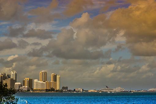
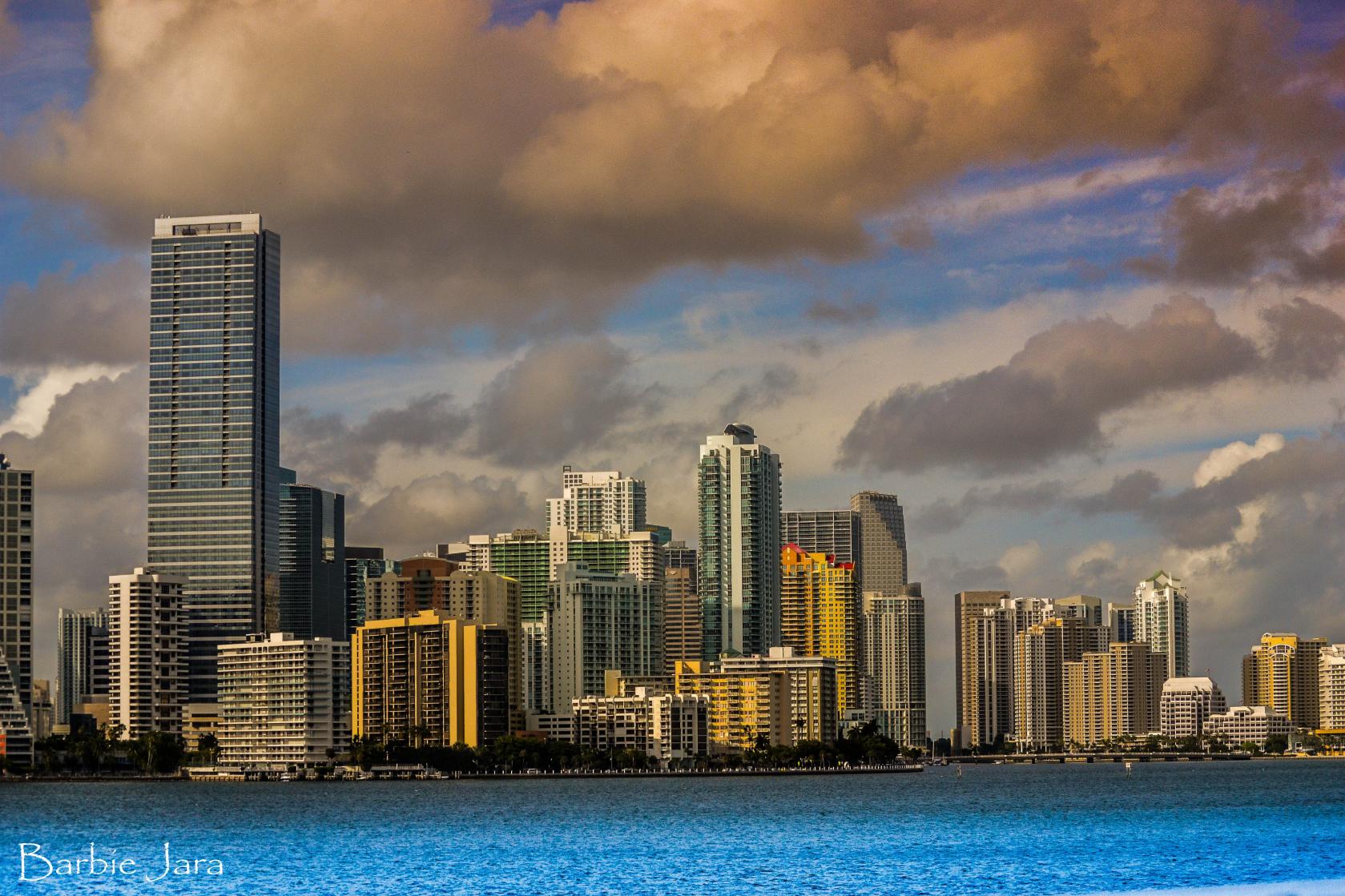
    This is the city I live in. Here are 2 shots from the bay. I would really like to hear some critiques on these 2 images. Photos have been edited with lightroom.

    Thank you all for looking.


    My city Miami, Florida-miami.jpgMy city Miami, Florida-dsc_0683.jpg

  2. #2
    Ken ksbryan0's Avatar
    Join Date
    Dec 2009
    Location
    Delphia, MT USA
    Posts
    1,160

    Re: My city Miami, Florida

    Barbie, these are both nice cityscape images, and appear to be sharply focused. I am guessing that at least the first, if not both, are the product of some HDR processing. The noise level is evident and should be cleaned up. While the first image does a fine job of depicting a section of the city, I like the variety of the second image better. You had a nice sky to work with on these, but I'd crop out half of it in the second image and make it more of a panorama composition...I actually think that would be a pretty compelling vista. I do like the near tree/shrub you included in the frame, as it helps with perceived depth. The gradient of blue in both skies is a little over the top, ranging from a deep purple (not the band) to pale blue - I'd suggest tweaking the saturation a bit to make it more believable. I can't really tell if the water is over-sharpened, out of focus, or what is going on there, but the color seems borderline unreal (never been there, maybe it is that blue) and I think it would be less distracting if you could smooth it out. If you can re-shoot this, go with a longer shutter speed and that should help.

    Overall, I think you've put some good technique to work here on the captures, and a little more time in PP should yield you a couple nice wall hangers!
    Ken

    My Website: His Creation
    "You miss 100% of the shots you don't take." Wayne Gretzky

  3. #3
    Senior Member hminx's Avatar
    Join Date
    Jan 2009
    Location
    New Zealand
    Posts
    2,154

    Re: My city Miami, Florida

    The first shot to me seems a little unbalanced with that large building tucked against the left edge of the frame, had you swung left a bit and bought more of that part of the city scape into the image I think the composition would be improved. Also if you check the water front you will see its leaning a bit to the left. Kens right about the over saturation but I sorta like it as is for some reason.
    Pete

    Isn't it a cool thing in nature that the colours never seem to clash...

    I have no issues with you editing my photos

  4. #4
    GB1
    GB1 is offline
    Moderator GB1's Avatar
    Join Date
    Feb 2004
    Location
    San Diego CA
    Posts
    9,960

    Re: My city Miami, Florida

    Hi Barbie -

    My first impression is that these are definitely artistic works rather than pure photography. the first has interesting composition and color. I love the way the tall building on the left anchors the shot and the space to its right is filled with very interesting cloud formations. The darks and whites in the clouds really work for me. The area that I think the image should be improved is 1) fix the distortion at the bottom water line, which really shows or looks like barrel distortion (interestingly, the buildings on the left look fine. Hmm), and 2) sharpen it up a tad, as the detail in the buildings should be a little clearer. Note that the website does some bad stuff when resizing, affecting some shots, so not sure the sharpness image is in the original.

    The second shot is a different angle - it seems more lonely, more plain. I think what it is missing is a subject, with too much negative space on the right side that leads the viewer to want more. If it were NYC and where the old World Trade buildings were it would make more sense to be like that, but I doubt there was something here before that's now gone.

    Hope this helps, and welcome to the forums.

    G
    Photography Software and Post Processing Forum Moderator. Visit here!

    -----------------------------------------------------------------------------------------
    Feel free to edit and repost my photos as part of your critique.
    -----------------------------------------------------------------------------------------

    My Site

Thread Information

Users Browsing this Thread

There are currently 1 users browsing this thread. (0 members and 1 guests)

Posting Permissions

  • You may not post new threads
  • You may not post replies
  • You may not post attachments
  • You may not edit your posts
  •