Please post no more than five images a day and respond to as many images as you post. Critics, please be constructive, specific, and nice! Moderated by gahspidy and mtbbrian.
By posting on the Photo Critique forum you agree to post only your own photos, be respectful, and give back as much as you receive. This is a moderated forum and anything abusive or
off-topic will be removed.
The first one really doesn't do anything for me. Wish the person were more visible, all that can be seen are his/her fingernails.
#2. Try cropping on the right, instead of the left. Also bump up the snow whiteness. This is my favourite of the three.
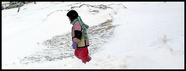
#3. It seems to be tilted (or it is for real?). A less tight crop should help compositionally, as there is too much space on the right. Try getting rid of the distracting car near the upper-left corner. I like the colours of the person's clothing.
The first one really doesn't do anything for me. Wish the person were more visible, all that can be seen are his/her fingernails.
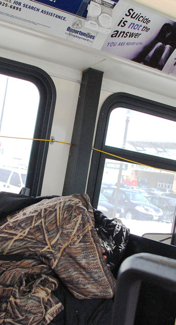
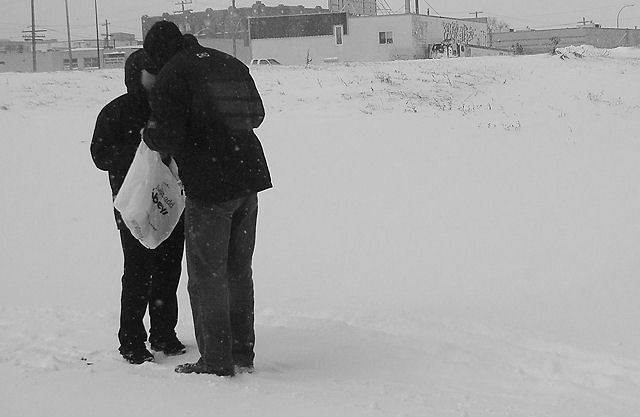
I'm going to completely disagree on this one, I see it as a really strong editorial statement with the homeless guy bundled up on the seat and the suicide prevention poster looming over his head, practically taunting him. Well spotted Don, this is a shot I would have taken, too!
Sort of a weak crop here Don. Good op but I just don't see these as being that strong. The top one has some interest but it's too clipped off to work - needs better technical execution. Sorry. Alas, there will be more snowstorms in the wonderful north for you to photograph..
G
Photography Software and Post Processing Forum Moderator. Visit here!
-----------------------------------------------------------------------------------------
Feel free to edit and repost my photos as part of your critique.
-----------------------------------------------------------------------------------------
I think the top is the strongest because of the story it tells. The crop on the suicide sign is a little tight and the handrail in the bottom right corner merges into the subject head.
1) It is a great editorial image that tells a story.
2) Everyone that has posted has an opinion about it-a sure sign of a strong shot.
3) Everything in the frame tells a story.
3a) The snow storm outside the windows.
3b) The placards in the bus.
3c) The tight spacing in the bus.
3d) The bundled up figure.
4) Don didn't even feel the need to jack this image around with a lot of post processing.
thanks all. Well the top photo was a grab shot--I didn't want anyone to see me take a picture of him inside the bus. I needed to do a lot of cropping to make the image credible and not too tilted and yet get both the sign and the man into it. Im not making excuses but these are hard shots to take and to finish. If I get anything worth while out of them I think I did my job.


 LinkBack URL
 About LinkBacks


 Reply With Quote