Please post no more than five images a day and respond to as many images as you post. Critics, please be constructive, specific, and nice! Moderated by gahspidy and mtbbrian.
By posting on the Photo Critique forum you agree to post only your own photos, be respectful, and give back as much as you receive. This is a moderated forum and anything abusive or
off-topic will be removed.
I choose to live my life to a different tune of music., one which is not censored or wrapped so much with a blanket of over -regulation, Health & Safety gone mad, fear and blind compliance to anything you are told to do...........
Downfallen, RIP
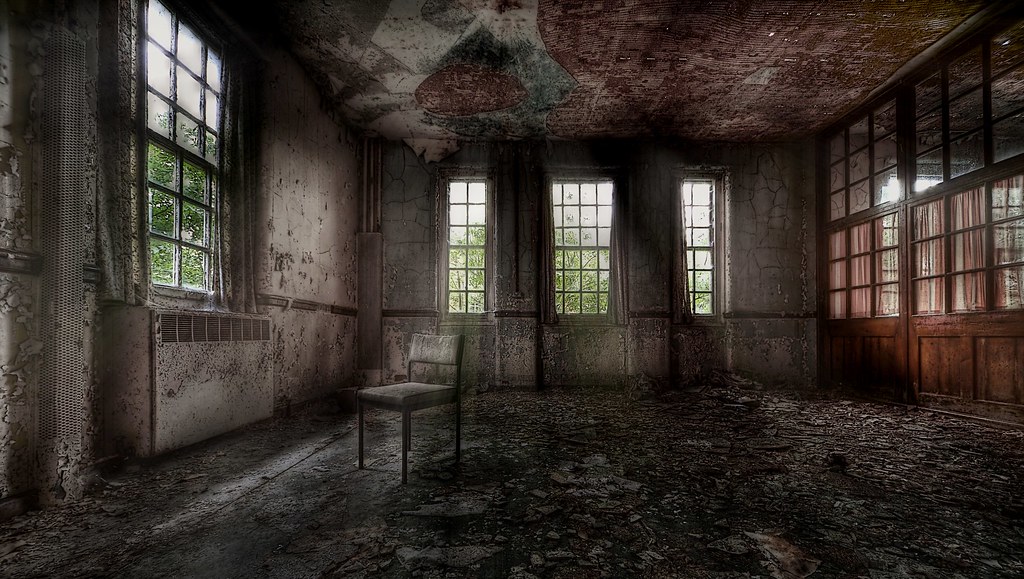
i like the composition here. i think the interior is a bit lighter than i'd like it on my screen. i wish it was very dark and forboding with only a few details, then the chair and light would stand out more.
Liban
"There is nothing like returning to a place that remains unchanged to find the ways in which you yourself have." Nelson Mandela
Hmm. This one's HDR intensity's a little strong on my work monitor VM. I am also not sure that the composition is as strong as your last images. I do like the chair, but I'm not sure it works where it's at. This pic may actually work better w/o the chair, so to create a feeling of a wide open room. For some reason, I want to see more of either the ceiling or the floor: seems too equally split as is.
These nits just go to show how strong your previous images were!
G
Photography Software and Post Processing Forum Moderator. Visit here!
-----------------------------------------------------------------------------------------
Feel free to edit and repost my photos as part of your critique.
-----------------------------------------------------------------------------------------
The wide angle distortions are pretty strong here, I'd prefer to see this scene from a higher, more compressed perspective. You've cut off more of the wall on the right side than the left side, which seems to contradict the otherwise perpendicular angle of this shot. Theres some CA noticable by the window on the left side top, possibly some in other windows too but hard to tell at this res. The lighting and shadows of the cieling doesn't seem to make any sense of the windows surrounding it. The window on the left is cut off just barely at the corner, poor cropping spot.
- Charlie
Feel free to edit and repost my work as a part of your critique.


 LinkBack URL
 About LinkBacks

 Reply With Quote


