Photo Critique Forum

Please post no more than five images a day and respond to as many images as you post. Critics, please be constructive, specific, and nice! Moderated by gahspidy and mtbbrian.
Featured Photo
Photo by hminx

Photo by hminx
Featured Photo Archive >>
By posting on the Photo Critique forum you agree to post only your own photos, be respectful, and give back as much as you receive. This is a moderated forum and anything abusive or off-topic will be removed.
Results 1 to 13 of 13

Thread: Time and money

  1. #1
    Looking... dwaugh's Avatar
    Join Date
    Feb 2006
    Location
    Bellingham, WA, USA
    Posts
    481

    Time and money

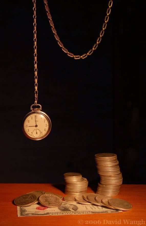
    First try on this shot. This was the best out of 48 tries. It is a bit dark due to my editing program where I resized it and cropped it a bit... I think it is alright. You tell me what you think.

    And if anyone wonders here are the dates of the coins:Two 50 cent pieces are from 1951 and two from 1941. Most silver dollars are 1923 and 1922, and two of them are 1900. The two dollar bill is from 1928. And the watch is old too.

    My Facebook Photography Page (Web-substitute) ~ Nikon D7000 | Sigma 10-20mm | Vivitar 28-85mm | Sigma 70-300mm Macro ~

  2. #2
    Senior Member
    Join Date
    Mar 2002
    Location
    nowhere
    Posts
    1,908

    Re: Time and money

    You need to white balance the image, to me it isn't really what you are seeing in the viewfinder IS IT, too yellow for me, the note doesn't display the green of the american notes. Looks like tungsten lighting, so your camera might need to be set to that white balance.

    Is the watch gold, don't think so looks more like a silver when you use balance colour in photoshop. Also could do with some unsharpen masking as well.

  3. #3
    Looking... dwaugh's Avatar
    Join Date
    Feb 2006
    Location
    Bellingham, WA, USA
    Posts
    481

    Re: Time and money

    This is the first try, so I will get it better on the second one probably. Lets see... first of all, the bill is from 1928, and there is no green ink on it, just shades of black and red. Yes, the watch is silver and I should try to make it look like that. The chain is golden so that looks right. I will see what I can do, as I am not big on editing too much.

    I need a filter for my lights...
    My Facebook Photography Page (Web-substitute) ~ Nikon D7000 | Sigma 10-20mm | Vivitar 28-85mm | Sigma 70-300mm Macro ~

  4. #4
    Looking... dwaugh's Avatar
    Join Date
    Feb 2006
    Location
    Bellingham, WA, USA
    Posts
    481

    Re: Time and money

    Here it is again, slightly edited. I dont have Photoshop so I did what I could. I think it looks a lot more natural.


    Something about this one isnt as good as the first one... it has less feeling to it I think. I need to go back and make it perfect, the best of both worlds.
    Last edited by dwaugh; 06-23-2006 at 09:36 PM.
    My Facebook Photography Page (Web-substitute) ~ Nikon D7000 | Sigma 10-20mm | Vivitar 28-85mm | Sigma 70-300mm Macro ~

  5. #5
    Senior Member
    Join Date
    Mar 2002
    Location
    nowhere
    Posts
    1,908

    Re: Time and money

    Then you are looking for an image that has warmth which is what the first one and to some degree this one as well has.

    Not being an American and knowing the history of your bills, I always thought they were Green, hence the terminology Green Backs. Are the coins all silver looking as well.

    Have you tried a white halogen light as your light source.

    Do you have white balance settings on your camera, if so look for tungsten setting and try that.

  6. #6
    Looking... dwaugh's Avatar
    Join Date
    Feb 2006
    Location
    Bellingham, WA, USA
    Posts
    481

    Re: Time and money

    Yes, the coins are all silver, and my camera has a WB setting for what I need. I'll try again tomorrow and post it in this thread.
    My Facebook Photography Page (Web-substitute) ~ Nikon D7000 | Sigma 10-20mm | Vivitar 28-85mm | Sigma 70-300mm Macro ~

  7. #7
    Looking... dwaugh's Avatar
    Join Date
    Feb 2006
    Location
    Bellingham, WA, USA
    Posts
    481

    Re: Time and money

    Ok, I edited it one more time and I think this one is the best. I would rather not try it again tomorrow since it was quite hard just to get it right - lighting conditions and reflections that is.

    My Facebook Photography Page (Web-substitute) ~ Nikon D7000 | Sigma 10-20mm | Vivitar 28-85mm | Sigma 70-300mm Macro ~

  8. #8
    Panarus biarmicus Moderator (Sports) SmartWombat's Avatar
    Join Date
    Mar 2004
    Location
    UK
    Posts
    11,750

    Re: Time and money

    Sometimes an exact reporduction isn't what you need to get the feel you want.
    I prefer the first one for it's slightly yellowed aged look.

    if you're re-shooting, try to remove that spot of light from 1 o'clock on the watch face.
    PAul

    Scroll down to the Sports Forum and post your sports pictures !

  9. #9
    Junior Member
    Join Date
    Feb 2004
    Location
    Colorado
    Posts
    41

    Re: Time and money

    I like the first one best too. I thought the color was intentional and that it made the whole image look sort of old like the money. The only thing that kind of bugs me is that I cannot see the top of the chair on the left. The right seems fine to be out of the image, but for some reason I keep wanting to see the top of the left side.
    www.TreatsForTroops.com

  10. #10
    Looking... dwaugh's Avatar
    Join Date
    Feb 2006
    Location
    Bellingham, WA, USA
    Posts
    481

    Re: Time and money

    The chair? I dont think I know what you mean, since there is no chair... oh well. I am becoming fond of the third one myself, since the floor is similar in color to the first one, and the coins and watch are just a bit more to the real color, but not as much as the second one.
    My Facebook Photography Page (Web-substitute) ~ Nikon D7000 | Sigma 10-20mm | Vivitar 28-85mm | Sigma 70-300mm Macro ~

  11. #11
    Junior Member
    Join Date
    Feb 2004
    Location
    Colorado
    Posts
    41

    Re: Time and money

    Quote Originally Posted by dwaugh
    The chair? I dont think I know what you mean, since there is no chair... oh well. I am becoming fond of the third one myself, since the floor is similar in color to the first one, and the coins and watch are just a bit more to the real color, but not as much as the second one.


    Uhhh sorry! Typo.. that was supposed to be chain.
    www.TreatsForTroops.com

  12. #12
    Looking... dwaugh's Avatar
    Join Date
    Feb 2006
    Location
    Bellingham, WA, USA
    Posts
    481

    Re: Time and money

    Ok, that makes a lot more sense now. The top of the entire chain is actually out of the picture where it goes out on the top right. it is all the same chain and I dont think there is a way, unless it were to look suspended in mid air, that I could get it to be in the shot. I kinda like how it is just hanging there, so imagination can be used as to what it might be hanging on. I just dont know how to get it into the shot and look good. Anyway, I was planning on cleaning this shot up and getting the coins back into the safe and get ready for another shot.
    My Facebook Photography Page (Web-substitute) ~ Nikon D7000 | Sigma 10-20mm | Vivitar 28-85mm | Sigma 70-300mm Macro ~

  13. #13
    Junior Member
    Join Date
    Jun 2006
    Location
    Kentucky
    Posts
    12

    Re: Time and money

    I like the first one best. It has more feeling.
    The only thing I would like to see changed would be to have the loop of the chain closer to the money, just seems to be too big of a gap between the loop and the change.
    Otherwise, the pic challanages the viewer to think.
    Good job.

Thread Information

Users Browsing this Thread

There are currently 1 users browsing this thread. (0 members and 1 guests)

Posting Permissions

  • You may not post new threads
  • You may not post replies
  • You may not post attachments
  • You may not edit your posts
  •