Please post no more than five images a day and respond to as many images as you post. Critics, please be constructive, specific, and nice! Moderated by gahspidy and mtbbrian.
By posting on the Photo Critique forum you agree to post only your own photos, be respectful, and give back as much as you receive. This is a moderated forum and anything abusive or
off-topic will be removed.
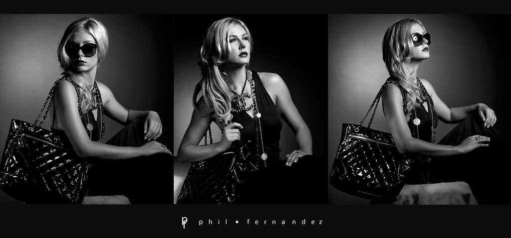
Excellent Phil, too hard for me to critique, your prowess in photography beyond my capability. My only lit pick wold be the left shot and the tight crop on the bag, particularly as the model is looking back over her shoulder, so I'd have liked to see more space to the left. I like the light on the middle shot and feel the background light on the shot to the right is a tad strong. I like how you captured to light in the sunglasses.
:thumbsup: Shootme...
Please don't edit and re-post or use my images (not that you'd want to anyway...). without my written permission. Thank you
Very nice set of shots, Phil. I agree with Peter about the cropped bag on the left, and maybe would like to have seen a bit more lighting on the bag in the middle and less light on the bg just next to it. Fine stuff.
I'm brand new to this site and to photography in general. I am completely humbled by the photos here! I'm a little uneasy even trying to make any comments but I guess I must if it's your constructive critiques I'm seeking. *sigh*
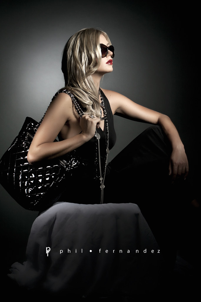
I LOVE the colored ones! Especially the red and the shine in the lips. It's such a dramatic splash of color across all that gray!
I would say Decent. The work's presented very well (like the minimalist feel), but each seems to have a slight issue. My favorite's the middle shot of the first series, but the bag is sort of dark and her face seems a tad blown out by comparison. The far right one's also well done and the bag is properly lit in comparison to her, but I can't take that reflection in her glasses The way her right shoulder is angled and shown also makes her look a tad weak/nonathletic (not sure that's a problem, just stating it .. she is a petite model). The far left one has very good overall composition, and expression; something bugging me about it though ...maybe it's too dark on the right side of her face?
One other thing - would like a tad more negative space around the model. But this is very subjective and depends greatly on how the images are ultimately used - in print, there is normally much text around the model and objects. It's all how the artist decides to put it together.
Gb
Photography Software and Post Processing Forum Moderator. Visit here!
-----------------------------------------------------------------------------------------
Feel free to edit and repost my photos as part of your critique.
-----------------------------------------------------------------------------------------
I would say Decent. The work's presented very well (like the minimalist feel), but each seems to have a slight issue. My favorite's the middle shot of the first series, but the bag is sort of dark and her face seems a tad blown out by comparison. The far right one's also well done and the bag is properly lit in comparison to her, but I can't take that reflection in her glasses The way her right shoulder is angled and shown also makes her look a tad weak/nonathletic (not sure that's a problem, just stating it .. she is a petite model). The far left one has very good overall composition, and expression; something bugging me about it though ...maybe it's too dark on the right side of her face?
One other thing - would like a tad more negative space around the model. But this is very subjective and depends greatly on how the images are ultimately used - in print, there is normally much text around the model and objects. It's all how the artist decides to put it together.


 LinkBack URL
 About LinkBacks


 Reply With Quote


 ffice" />


