Please post no more than five images a day and respond to as many images as you post. Critics, please be constructive, specific, and nice! Moderated by gahspidy and mtbbrian.
By posting on the Photo Critique forum you agree to post only your own photos, be respectful, and give back as much as you receive. This is a moderated forum and anything abusive or
off-topic will be removed.
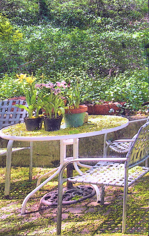
I agree with poker, I'm a little confused as to the skewed perspective of the photo. My best guess is that its a crop from a fisheye.
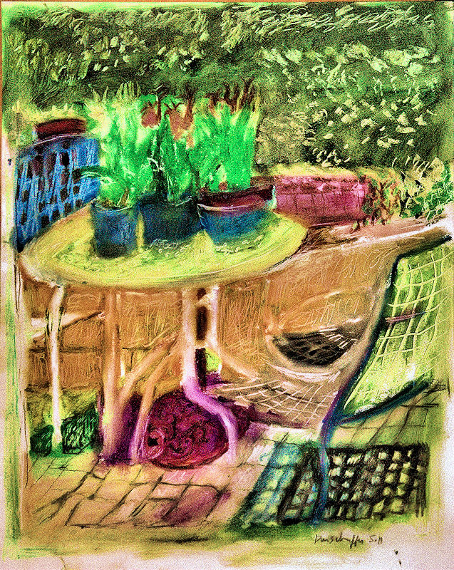
Anyway, suffice to say I'm not a fan of the photograph, the greens all look unpleasant. Your oil crayon piece however is very good! You've turned those ugly green hues into very soft and pleasant looking ones, the rest of the image is a pallet of pleasant hues as well. The chair on the right, and the legs for the table all look strange when compared to the original image, but I think its fine and gives the painting an abstract quality.
Nice work. The drawing distances the photo (which was just for reference anyhow). Only thing I do not like on your drawing is the left edge vertical which seems to constrict the table and other objects. I would have preferred it unconstrained.
Photography Software and Post Processing Forum Moderator. Visit here!
-----------------------------------------------------------------------------------------
Feel free to edit and repost my photos as part of your critique.
-----------------------------------------------------------------------------------------


 LinkBack URL
 About LinkBacks


 Reply With Quote


